
Why was all this necessary?
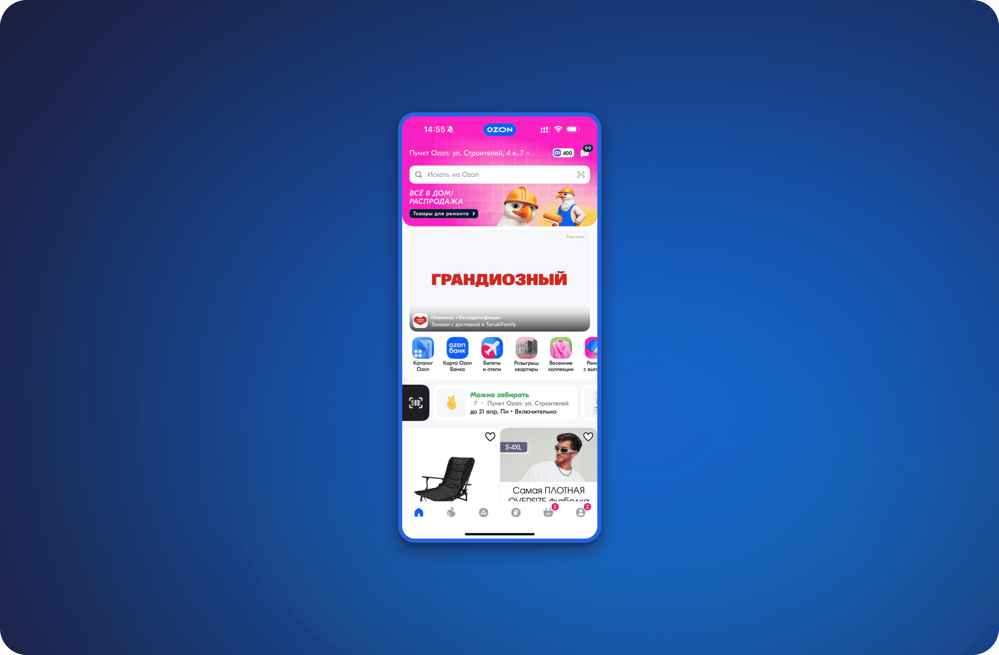
Originally, the Big Promo widget was perceived as just another product shelf. It was poorly noticed, did not generate interest, and few understood that a whole promotion stood behind it. Users did not click, did not engage, which meant that the value of the promo was lost. At the same time, the marketing team complained that it was inconvenient for them to manage campaigns and analyze their effectiveness.
My task was clear: to make the promo block really work — to engage, to be noticeable, to lead people to promotions, and to help the business. And also — to simplify the work of the team that creates these promotions.
Where did I start from
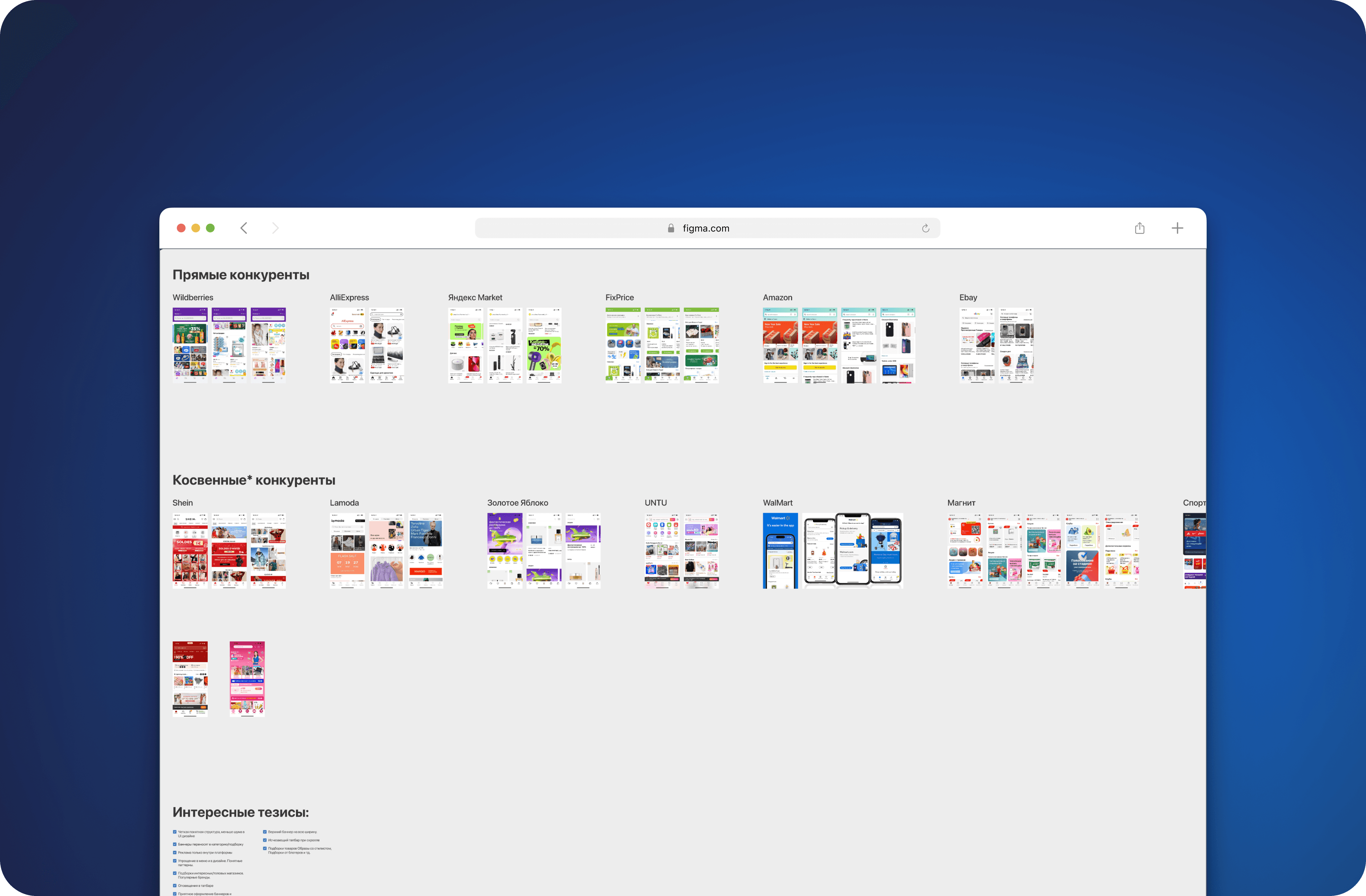
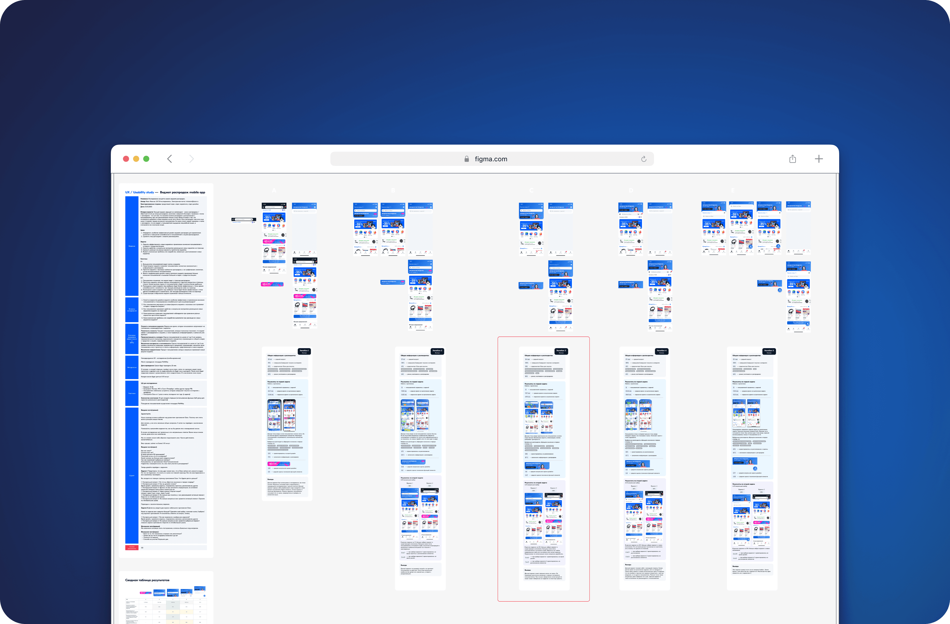
I carefully studied user behavior – how they interact with promotions, where they get lost, what they click on, and what they ignore. I spoke with marketers and looked at the analytics. It turned out that the widget simply does not function as an entry point: it gets lost among the content and does not convey anything important. We started changing this.
What did specifically?
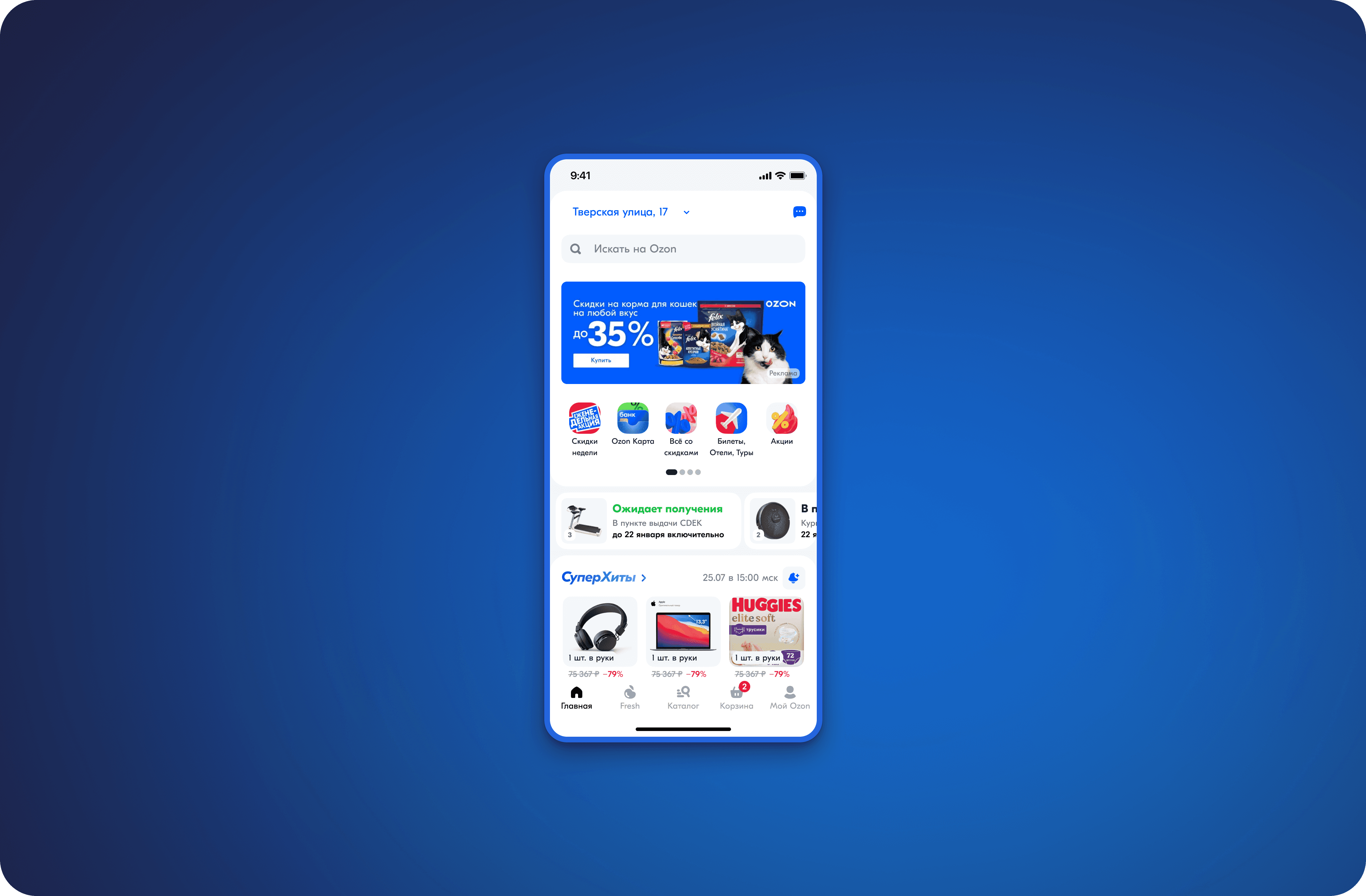
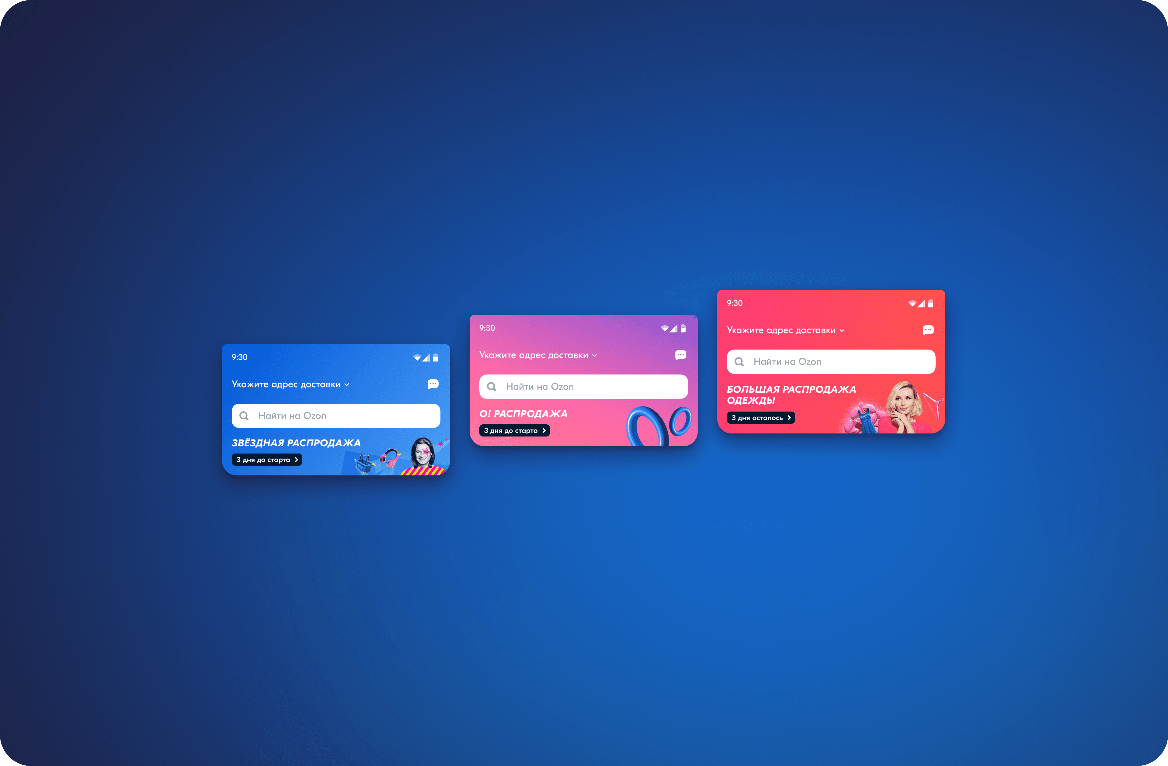
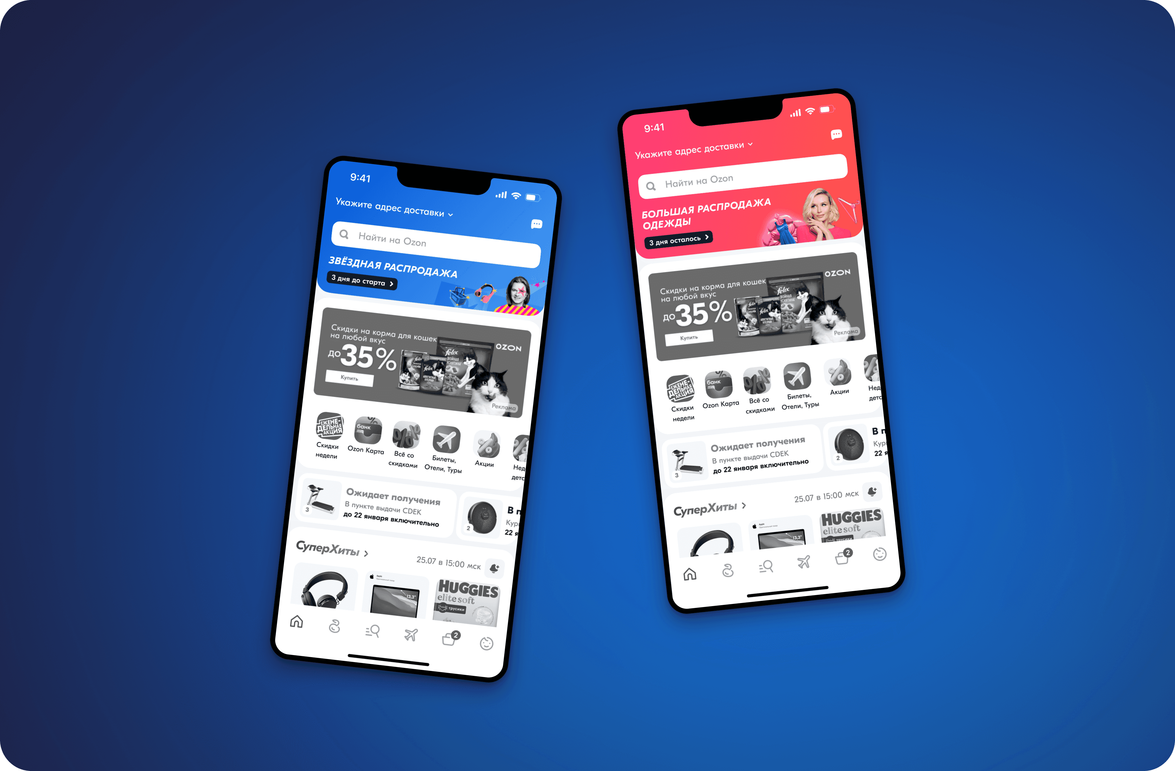
I completely revamped the widget's design: I made it brighter, livelier, added animation, a timer, and a clear call-to-action. It became responsive and looked appropriate both on the web and in the mobile app. After that, the metrics started to improve: more clicks, higher engagement, better conversion.
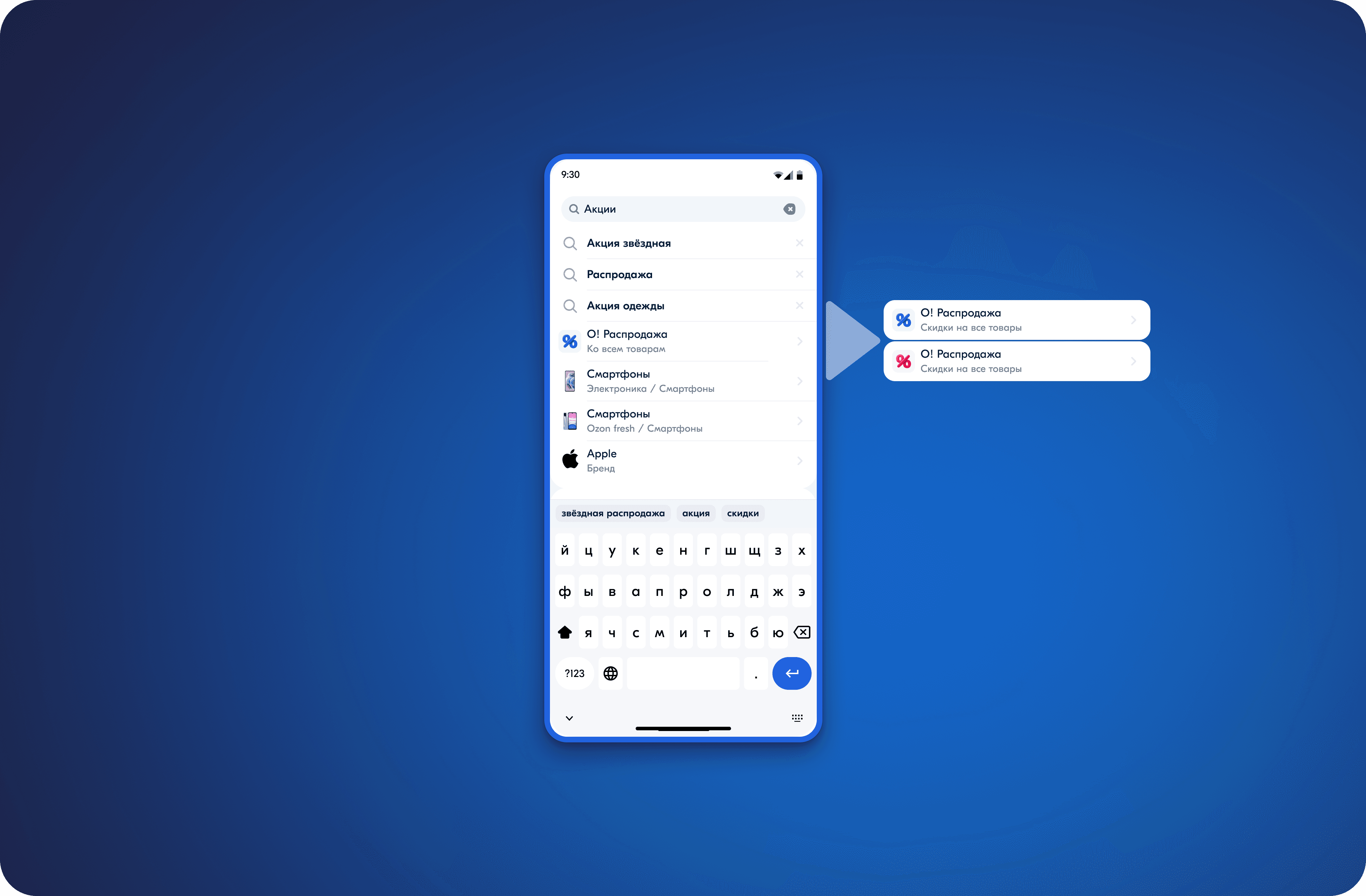
At the same time, we updated the filters and search suggestions — we made them more noticeable and useful. It became easier for people to find products, they spent less time searching, and they completed purchases more often.
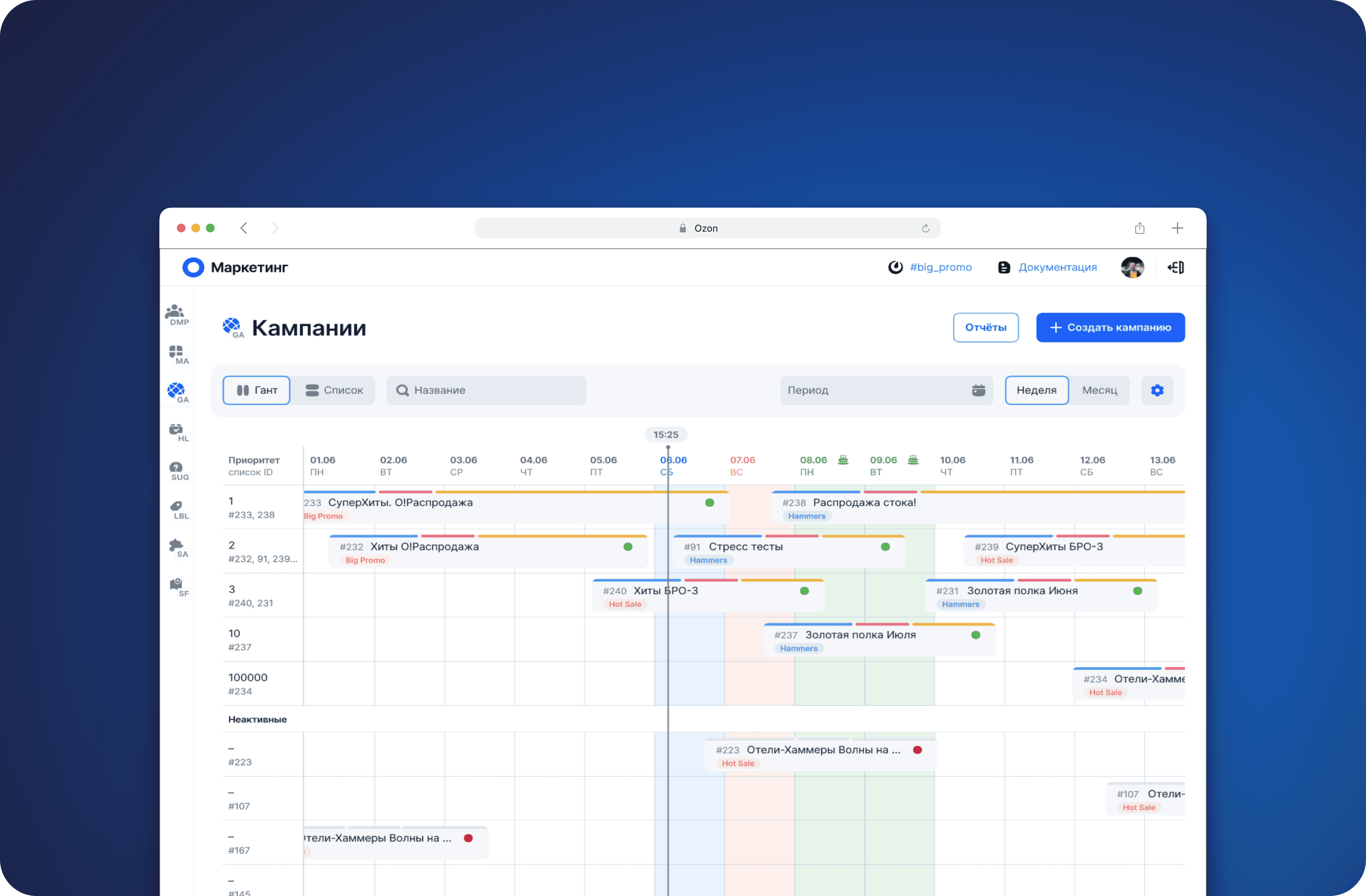
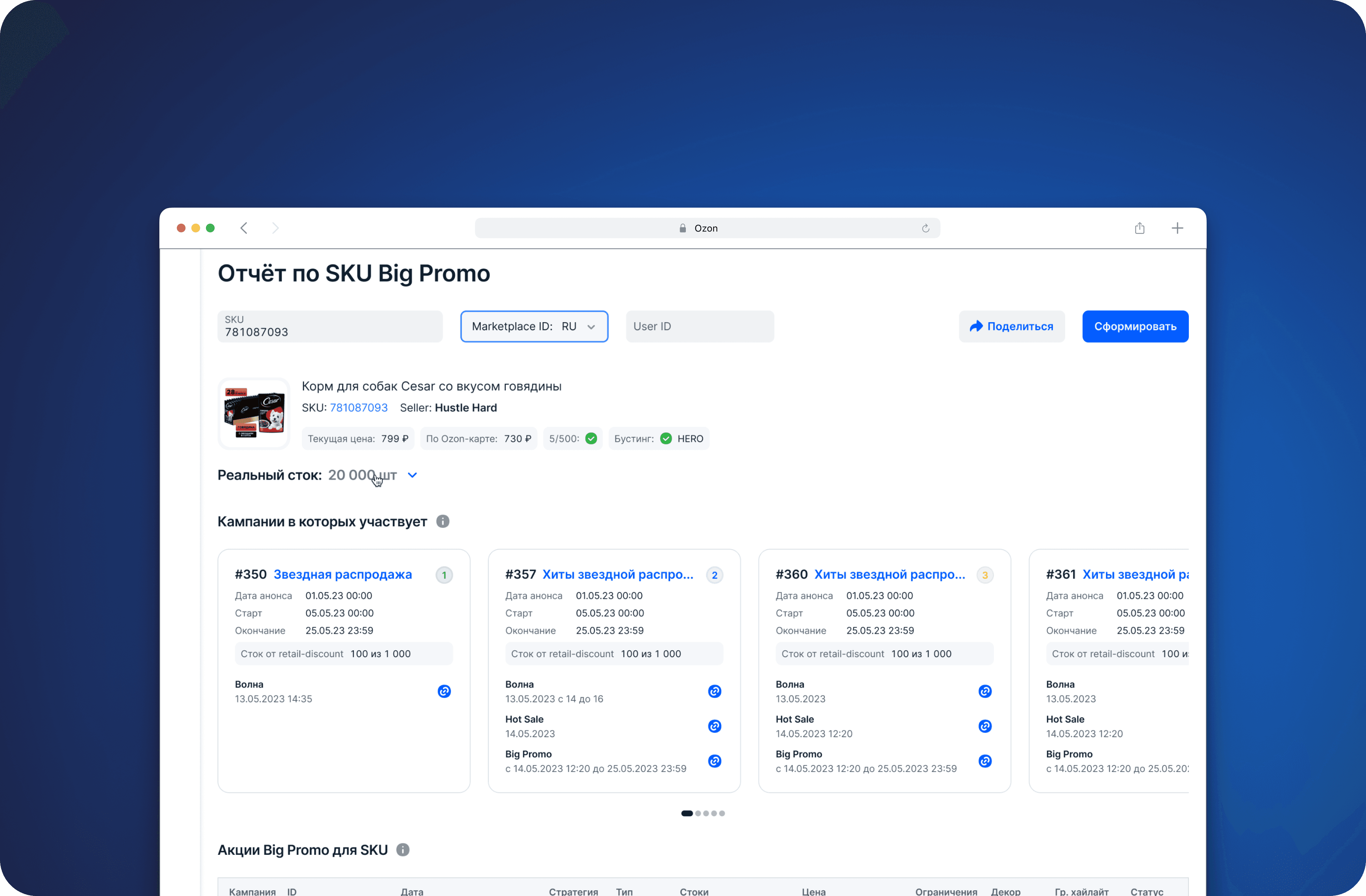
For the marketing team, I designed and implemented visual tools: a Gantt chart for planning promotions and a detailed report with a clear display of statuses, badges, and decorations. This reduced coordination time and simplified analysis.
What ultimately
The updated Big Promo widget has become a real focal point: click-through rates have increased, and conversion improved by 15%. People have started using filters more actively and found the necessary products faster. The team finally received convenient tools that could be used without unnecessary tables and manual reconciliation.
What I understood
A simple, thoughtful, and engaging interface can change the perception of an entire product line. Sometimes it is not enough to just showcase a product; rather, it is essential to create an emotion, emphasis, and a sense of urgency around it. Additionally, internal tools are just as important as external ones. When people find it convenient to work, they accomplish more and enjoy doing it.
The Big Promo project has become an excellent example of how a systematic approach to design enhances both user experience and business results.
Tools and approaches
Figma, Miro, Pathway, A/B tests, UX research, User Flow, usability tests, working with marketing analytics